At least ten people were sitting on the other side of the table. I felt like at my high school graduation. The official site of the Hungarian National Museum was at stake. This time the two of us made the referral. But as soon as we got to the triumvirate of content management, usability, and agility, the dividing line drawn by the table started slowly to disappear.
Integral Vision

At least ten people were sitting on the other side of the table. I felt like at my high school graduation. The official site of the Hungarian National Museum was at stake. This time the two of us made the referral.
But as soon as we got to the triumvirate of content management, usability, and agility, the dividing line drawn by the table started slowly to disappear.
The foggy promise
In a few days, the plan turned to reality. We discussed the functions every second-week, paying particular attention to the structure and graphic design. Ideas coming from different directions started to take shape: should be modern and, at the same time, old fashioned, innovative, and conventional.
In line with the development, we started the site-building as well. We did not rush with the makeup: we matured the visual design until every participant of the project felt satisfied with what they saw.
As long as the graphic realized entirely through, any function-demo you show will be saltless, as your imagination needs to dress up the naked site. It requires a lot of patience and trust from the customer. They need to trust that the two lines really will reach each other, and the live site will meet the previously visualized design. This kind of trust usually forms slowly, in minimal steps in case of a new partnership.

While the team was enthusiastic about the plans and technical solutions, I tried to show the progress and catch the customer’s signals. The undressed function is half the battle for the developer, but only a promise for the customer. A commitment that he soon will be able to touch that beautiful user interface he desired.
The price of simplification
We selected the views carefully, and meanwhile, we worked out a walking logic that can stir the user the preferred way. In the beginning, all museum departments wanted to show their entire content on the front page. But after a couple of discussions, we convinced them that first of all we are creating the site for the museum visitors, not for the museum itself. So the content related to the organization is secondary compared to the end-user experience.
We started with a dozen leading items. All of them were important and necessary. But together with our customers, we began to sort and trim. No mercy, we needed to roll back the main menu to seven items. While we thanked George Miller, the Museum menu sucked: all organizational needs got aligned there, which we could not reduce to seven, no matter how hard we tried to reshuffle. Eleven categories and the overladen Museum information group were the prices we needed to pay to simplify the front site and general navigation. It was worth it.
Relaxing is good
Szilárd started to design a view showing the exhibitions on the leading site. In the beginning, he visualized something like this:
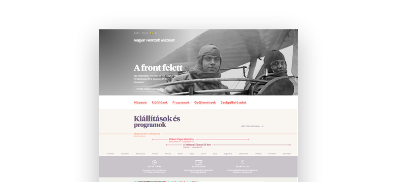
But after some other variations, we rejected the idea. We tried with some different shapes, but we did not tumble on the right one, which is original, usable on all monitors, and has a satisfying visual aspect.
It was evident that there was no need to rush the process, but rather let it rest for a while, and get back to it after some sprints. Finally, this one became the winner:
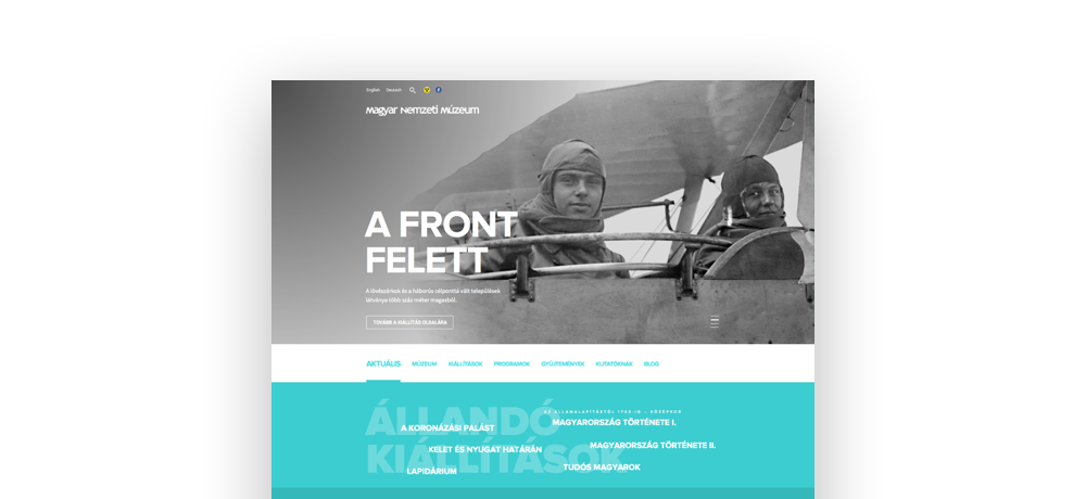
We welcomed the customer’s idea of illustrating the exhibitions with panoramic photos. The user gets an impression of the exhibition hall and can easily decide whether to visit or not. The renewed show, which covers four hundred thousand years from prehistory till the Settlement, could, for example, be a pleasant surprise.
Final
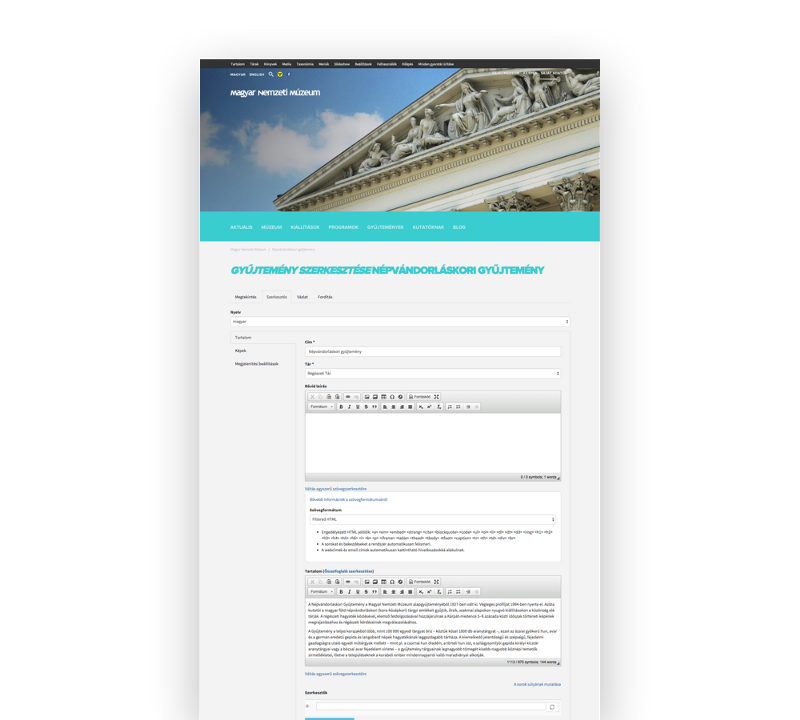
After finishing such main functions as collections, ground plan, phone register, public data, events, and blog, we started to fine-tune the layout and text control. Each content got an English and a Hungarian editing interface. We considered four editing breakpoints: mobile portrait, mobile landscape/tablet portrait, tablet landscape / regular desktop, XL desktop.
The editor can select in which color scheme he/she wants to add a content node.
In the last two iterations of the project, we helped the customer with uploading contents, while also doing the testing and error-correcting.
The Museum show
It is our first museum project, but we know for sure it is not the last one. It is a pleasure to work on a website that my retired aunt also understands and appreciates. Get this museum show on the road!
Share with your friends!